Save Our Children
Please play in fullscreen for the best experience
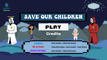
A psychopath cult has kidnapped all of the children in the town you are the only one who can save them.
If you want tou use both hands you can use K for meele Attack and L for throwing slippers
| Status | Released |
| Platforms | HTML5 |
| Release date | May 10, 2021 |
| Author | Hopeful Games |
| Genre | Platformer, Adventure, Shooter |
| Made with | Unity, Aseprite |
| Tags | 2D, Cute, Pixel Art, Singleplayer, Unity |
| Average session | A few minutes |
| Languages | English |
| Inputs | Keyboard |
| Accessibility | Subtitles, Interactive tutorial |


Comments
Log in with itch.io to leave a comment.
Review:
This was... not great
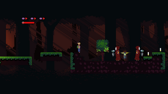
The level design was horrible. Why would you put 3 enemies on the same tiny platform that you need to jump on?
The camera doesn't fit the game. It just jumps around, showing me everything I don't need to see, and just made me motion sick.
The player's moveset was very poorly designed. The ranged attack requires that you pick up your projectiles before using them again. The issue is that you need to go out of your way to go get them again! People are lazy, and they are not going to get out of their way to pick up something that doesn't even help that much.
The melee attack is one of the worst attacks I have ever seen in my life. I have played a lot of bad games, and they have some terrible attack mechanics, but they honestly don't come close to this.
I'll make this simple, and hopefully, you can figure out the issue. The enemy is always moving, and the attack only hits 2 pixels in front of you.
The best strategy I found for getting past enemies was to just run into them spamming attack. I would die, but that the only way to get past them. (if the best way to get past an enemy is to kill yourself, that is a problem)
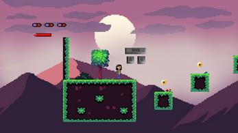
The art was honestly confusing. If your going to make a pixel art game, at least make the pixels the same size.
The players jumping animation sucked, mostly because there wasn't one. Walking in the air never looks good.
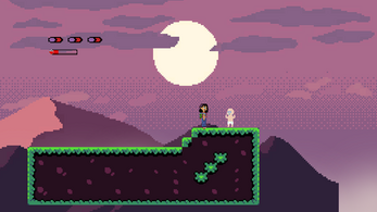
Other than that, it looks fine. The baby is the ugliest thing ever, and there are several tileset-ing issues, but it is fine.
The music was good! It sucks that it doesn't fit the game at all. The second level song was great, but it just.... doesn't work with the entire psychopath cult thing.
The sound effects were awful. The jump sound was just so annoying, the attack sounds were so annoying, everything was just soo annoying. The whole "all done" thing that plays when you touch the ugly baby was annoying, just awful all around.
2/5, bad game design, bad level design, terrible graphics(except for the background, pretty neat!), horrible sound effects, and just a waste of time.
First of all this game has made in 7 days to practice and learn Unity for the first time .I updated the game and fixed some things you mentioned. Now camera is a little better . Now when you throw the slippers and don't take them back they will come back to you automaticly a few seconds later . I increased the meele attack's range hope it works . The reason why the pixel art's size don't fit each other is most of the thing is coming from various free assests and it is hard to find assest that fit each other. I changed some off the sound effects I hope it is not so bad now . The reason that there were 3 enemys on a tiny platform so player jump on them gain a vertical speed and pass the platform but I changed it it is normal now. I hope the game is better now I will keep adding new levels and improving my game desing and can you change your review according the update and be aware that this game just made for fun and learn.
I totally understand that! I make games for fun and learning too. I make reviews like this because I hope they could be used to help improve your future games!
I'm really sorry if I was rude or anything like that, I just get honestly upset, because some things are just obvious to me, and but not obvious to newcomers.
I will say, the new camera definitely fits the game now. The previous camera was made for something where you would keep moving in a direction, without stopping every 2 seconds.
The slippers are kinda infinite now... You can just spam them to your heart's content, but even that was an improvement. Honestly, I had a much better time with the game because of that.
I understand trying to make the player jump on the enemies like that to get to the other platform, but here is a little level design tip that I realized after tons of testing:
Never force the player to get hit.
Unless you have a really good reason for it, don't force the player to get hit to progress. Obviously, there are exceptions... In Celeste chapter 5, the game forces you to kill yourself in the pov of a monster. It was to teach you that the monster is dangerous.
In the context of your game, the player will reach that point, and then get stuck trying to figure out how to get past it, grinding the pacing to a halt. They could try to attack them, but they would die several times trying. They could shoot them, but the angle is just too awkward to do so. Honestly, it doesn't even matter that you require that they take damage, what sucks is that it just disrupts the flow of the game, and that moment just sticks out. It also ruins an opportunity for a player to try to beat the game without taking damage.
I was playing, and I realized that the jump sound effect was replaced! It took a while for me to notice it, because of how much more natural it was. While I was making my game, I tried to put in some walking sound effects, but it felt too out of place and unnatural, that I just removed it.
Score raised to 3/5, making the ranged attack infinite made everything much more enjoyable! The level design made sense, and because of that, it was much more satisfying, and thus, not as much as a waste of time.